
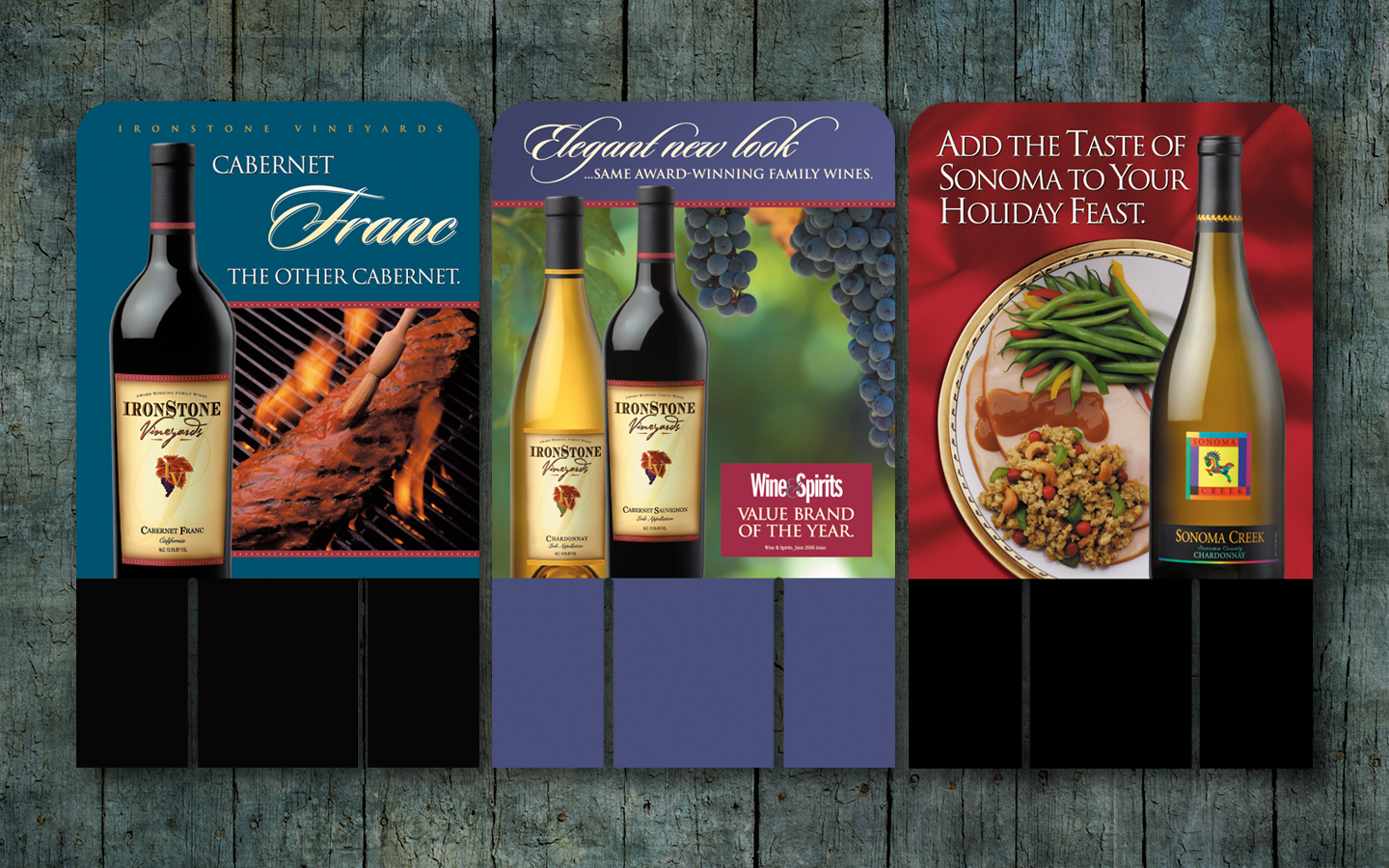
When thousands of brands compete in a single category, there had better be a good reason to stand out if success is in your future. Ironstone’s farm-to-glass story unfolds like a stroll through the vineyard. When introducing new brands or supporting existing ones, Ironstone turned to Cummings Design + Advertising for help pursuing the retail customer with their in-store decision-making. We designed point-of-sale case cards that encourage shoppers to look beyond the label by using striking and appetizing photography that suggest perfect food pairings. Elegance with an approachable style is conveyed with the typography.

Bank of Stockton has a brand that fully reflects the exceptional work of its employees, and the remarkable experiences they create for customers every day. We set out to show their communities, and the world, what Bank of Stockton customers have known for a long time: this is a Bank dedicated to understanding their customers’ needs, and to doing what it takes to give them the best personal service possible. Our awareness of the customers’ state of mind and changing priorities comes through in the concept of this billboard. The result is a communication that feels consistent and strong, but also helpful and understanding.
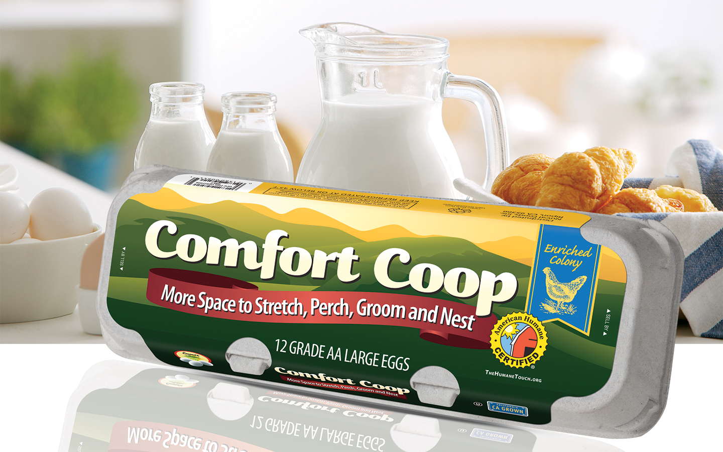
Cummings Design + Advertising was given the challenge to position and launch a new product into a mainstream arena that is socially-responsible fresh eggs. We set out to introduce a new brand that concentrates on the improved living arrangements of a co-op of family farms’ precious hens. The new brand came to life in a powerful and targeted launch effort designed to drive awareness and engagement. We incorporated a lively, colorful illustration of rolling hills, modern typography, fresh messaging to emphasize quality, freshness and a new perspective. The design speaks to consumers who understand that happy chickens make better-tasting eggs.
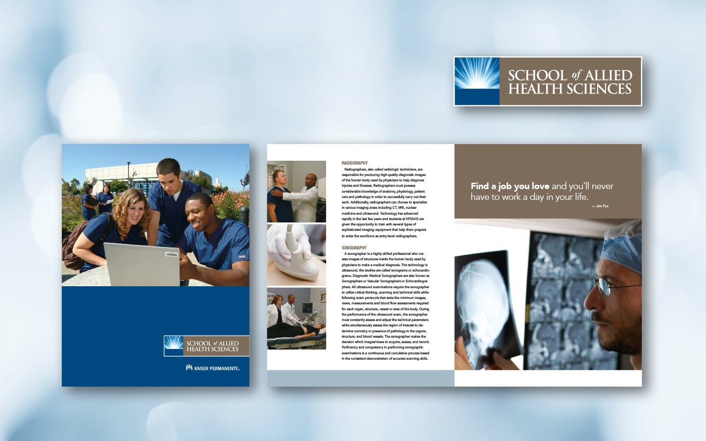
Kaiser Permanente’s School of Allied Health Sciences had the foundation for success but lacked marketing communication to deliver and support the experience of receiving a top-flight education in health care. To celebrate their 20th Anniversary, Kaiser Permanente chose Cummings Design + Advertising to create a new branding program for the school. We sought to create an updated visual identity that would better capture the energy, passion and progressive drive of the school. The new logo was designed to evoke both the spirit and science of true discovery, abstractly referencing both the moment of inflection when something new is uncovered or created. The brochure that followed detailed the schools many programs with vibrant colors, modern typography and approachable photography.
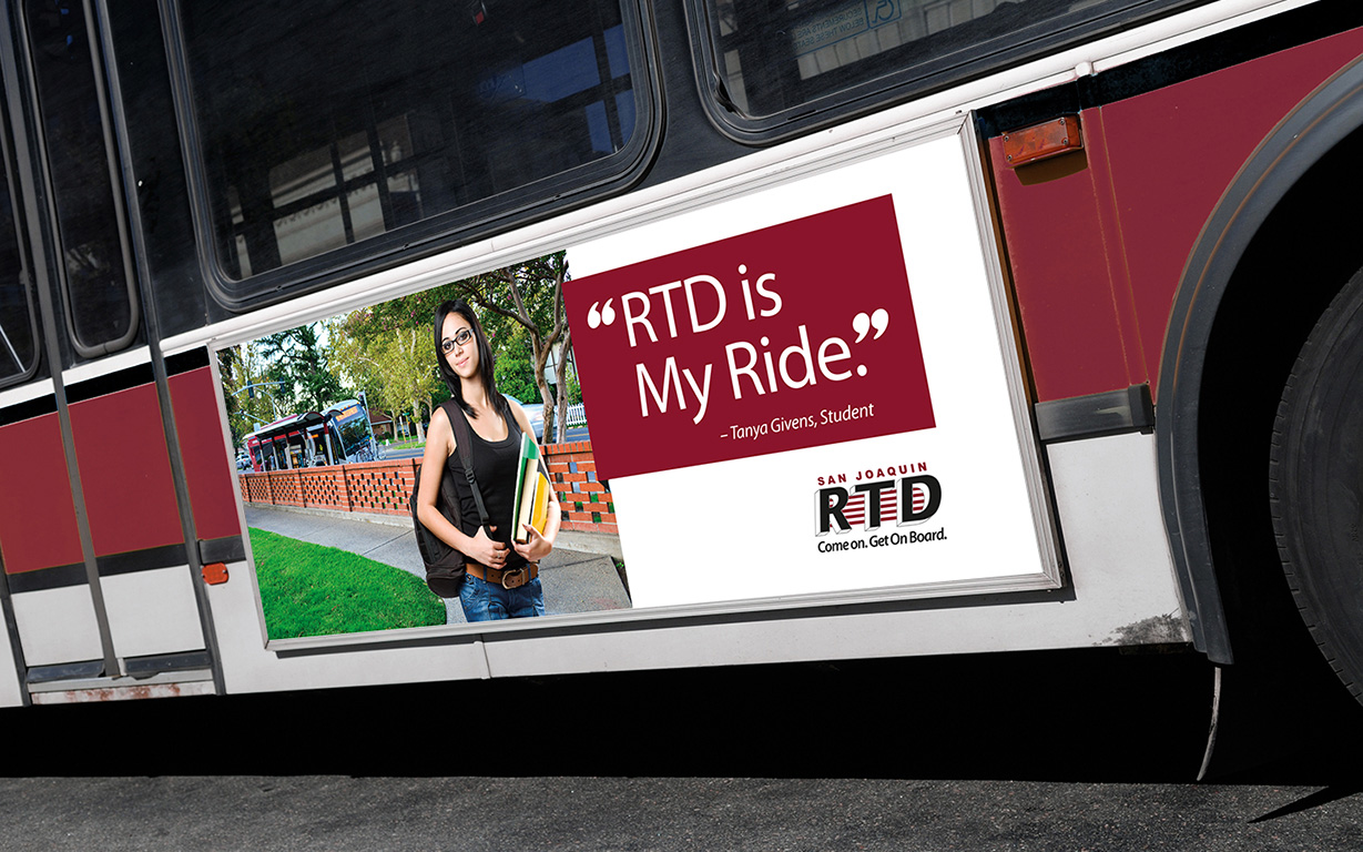
San Joaquin RTD offers a thriving network of bus routes linking the communities of San Joaquin. After working with them on a series of 50th Anniversary projects, we suggested a testimonial campaign that could be featured on their own buses and stand-alone outdoor billboards. Cummings Design + Advertising created a striking series of transit and outdoor billboard ads that communicate why people ride SJRTD. The campaign speaks to San Joaquin RTD’s mission in a way that turns civic transportation into community service.
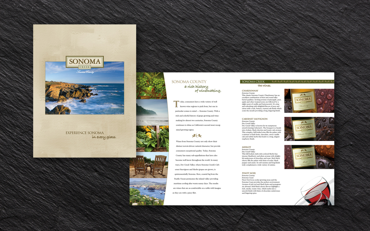
Having just completed a rebranding, it was time to reintroduce Sonoma Creek wines to existing customers while catching the attention of potential new ones. Our solution features the beauty of Sonoma County while describing the care and craft that goes into every bottle. It’s photography and descriptions transport the reader to Sonoma County to enjoy a laid-back weekend with friends or loved ones. It gave those who tried Sonoma Creek a taste of “Sonoma in every glass.”
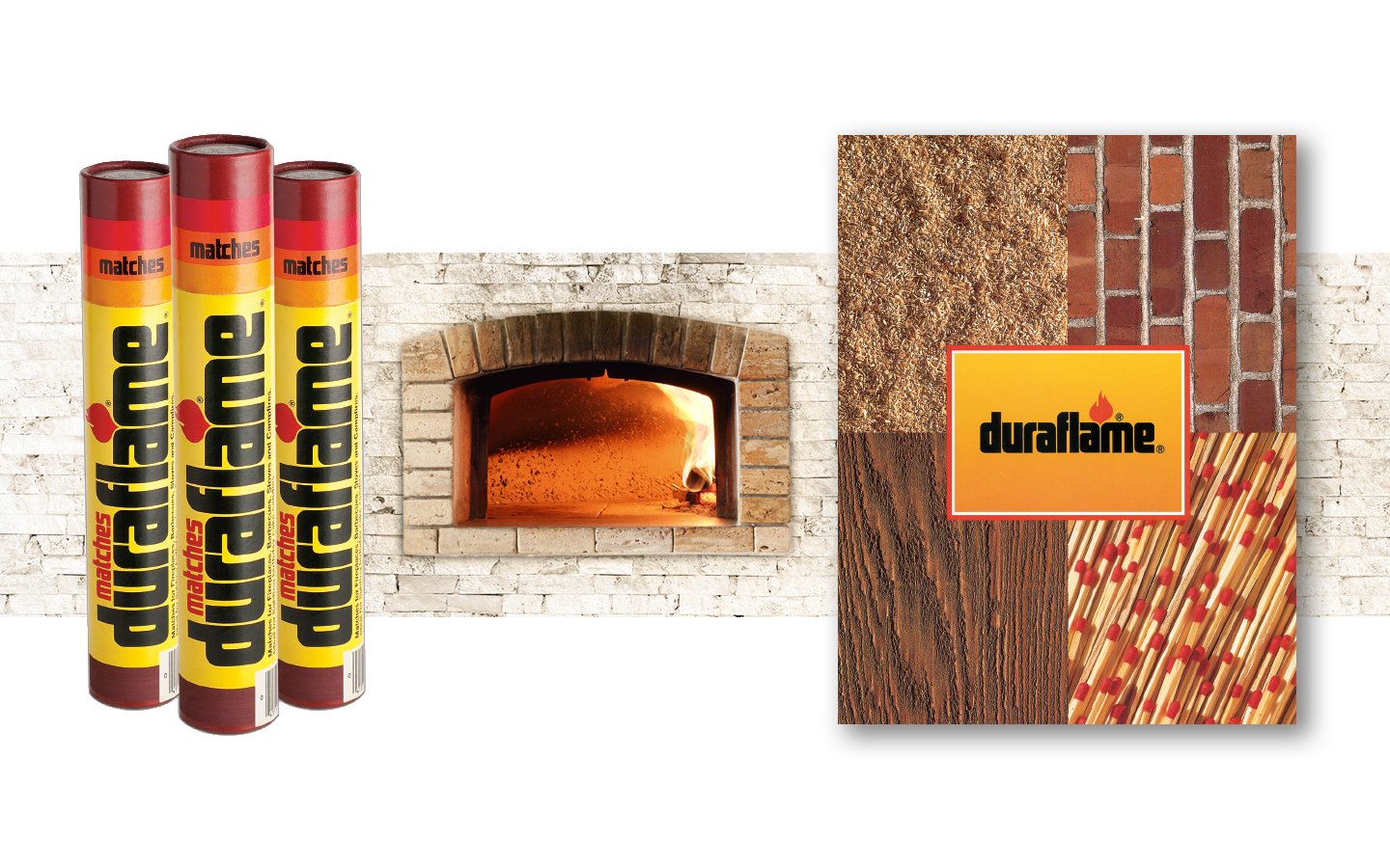
Duraflame Firelogs have lived in American hearts and hearths for over a half century. The company came to Cummings Design + Advertising with the need for a fresh, new branding campaign. Traditional primary colors were maintained while adding a cleaned-up series of packages for various products and private label brands. In addition to packaging, Cummings Design + Advertising developed all POS displays, sales materials and several national advertising campaigns with multi-million dollar budgets. Focused campaigns and a lot of hustling was rewarded by extraordinary growth, with the firelog brand capturing over 60% market share nationwide.
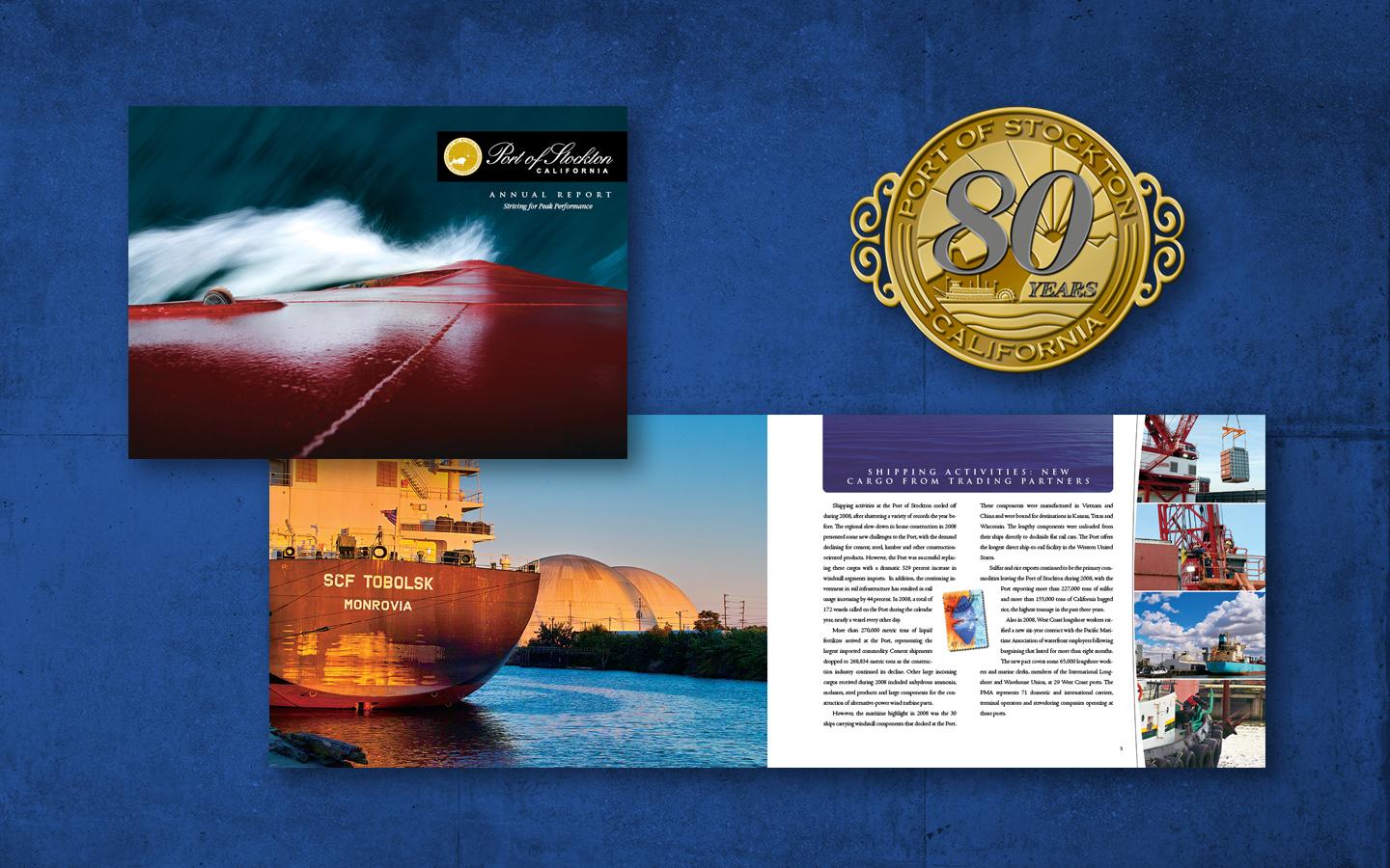
PORT OF STOCKTON – LOGO DESIGN & ANNUAL REPORT
Celebrating 80 years in the Stockton area, the historic Port of Stockton wanted to commemorate their tradition of hosting ships from dozens of different countries each year. They brought in Cummings Design + Advertising to freshen their annual report design and to create a new commemorative logo for their 80th Anniversary. Vibrant, iconic photography against a clean, bright layout highlights the success and growth the Port has experienced during its 80 year run.
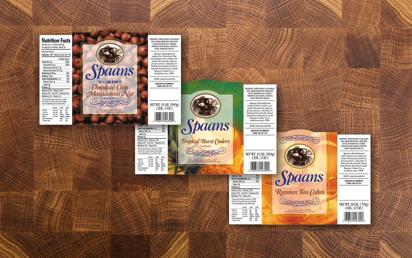
When Spaans Cookie Company—A regional brand of artisan cookies—asked us to redesign their 25-year old packaging, we saw an opportunity that scaled far beyond the package. There’s a remarkable love and pride in the craftsmanship behind Spaan’s cookies that wasn’t being communicated in the overall brand expression. We set out to capture the historic European spirit of Spaans Cookie Co., reflecting a passion for cookies in the brand identity itself. The image of the family’s entrepreneurial grandfather combined with sophisticated typography from yesteryear team up to create an indelible image of quality and tradition.

IRONSTONE VINEYARDS – LEAPING HORSE PRESENTATION FOLDER & CONSUMER MAGAZINE AD
Leaping Horse made a big splash when it entered a very competitive marketplace. Its introduction was followed by sales of 500,000 cases per year and two consecutive years as the Impact Hot Brand of the Year. Cummings Design + Advertising was asked to create consumer magazine advertising supported by point-of-sale materials and a new sales kit. By leveraging the color palette, we created a series of case cards that nearly jumped off the shelf, while the sales force enjoyed new, colorful sales materials to further boost the brand’s business-to-business sales.
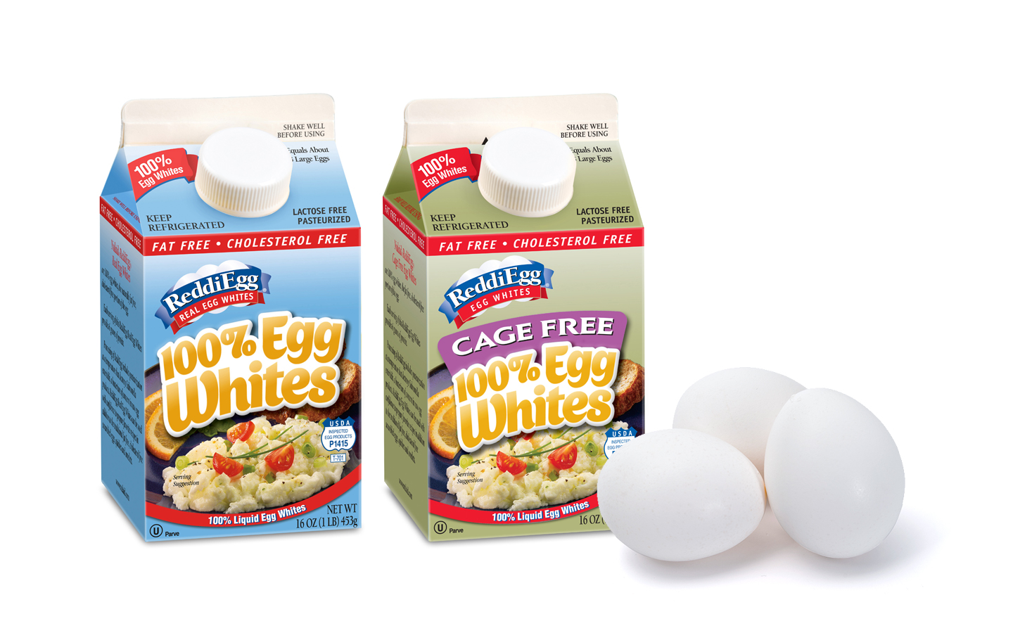
NuCal Foods came to us with a terrific product, a competitive attitude and a marketing team ready to create an epic change in the liquid egg category. But they had a package that wasn’t going to get them there. Introducing vibrant colors and evocative custom typography gave the retail presence much needed depth and impact. We were able to capture the beauty of real food—delicious, not artificially perfect.
.
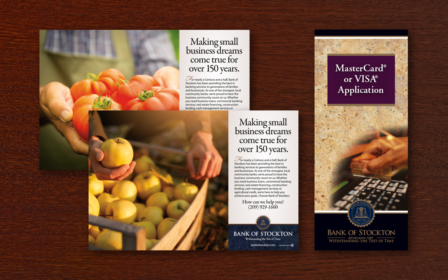
We were tasked with creating a brand that reflected Bank of Stockton’s most beloved traits: approachability, trust and exceptional customer service. We added a dash of sophistication and energy to the Bank’s brand identity, moving it forward with confidence and differentiating it from competitors. Along with the rebrand came the task of revamping the Bank’s series of rack brochures which are distributed in all of the Bank’s nineteen branches. Cummings Design + Advertising has carried the brand through all advertising media as well as marketing materials including website, annual reports, credit & debit cards, printed collateral materials, and wearables.

As part of a 20-year anniversary and rebranding of its School of Allied Health Sciences, Kaiser Permanente hired Cummings Design + Advertising to create a series of recruiting tools. Featured here are pole banners that were displayed at Kaiser facilities and parking areas, along with a series intended for use on the school’s campus. After creating a new logo and overview brochure, we elaborated further on the brand by creating tasteful business stationery, presentation folders, pole banners, pop-up banners, on-site signage, and sales sheets.
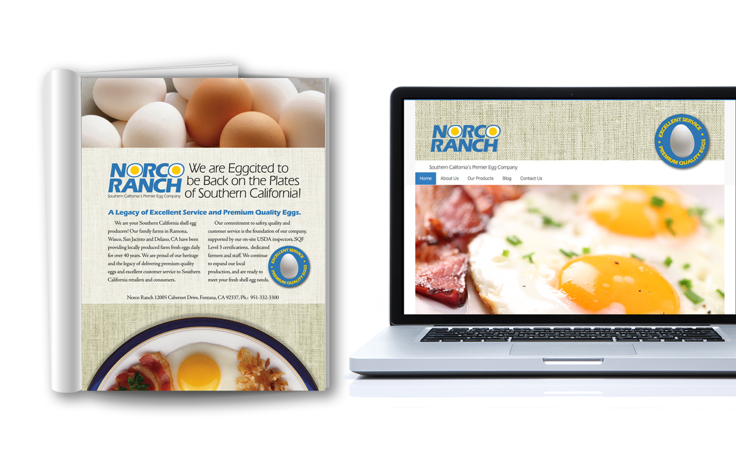
NUCAL FOODS, INC. – NORCO RANCH LOGO, MAGAZINE AD & WEBSITE DESIGN
Cummings Design + Advertising was tapped to rebrand Norco Ranch with a new logo, packaging, magazine advertising and website. As a prominent brand in Southern California, Norco Ranch had the framework in place to support more demand. We chose colors and textures to compliment the Norco Ranch brand while integrating top quality food photography to offer serving suggestions and to add appetite appeal. Their new website has further supported marketing efforts by providing an online presence for those seeking recipes and product information.
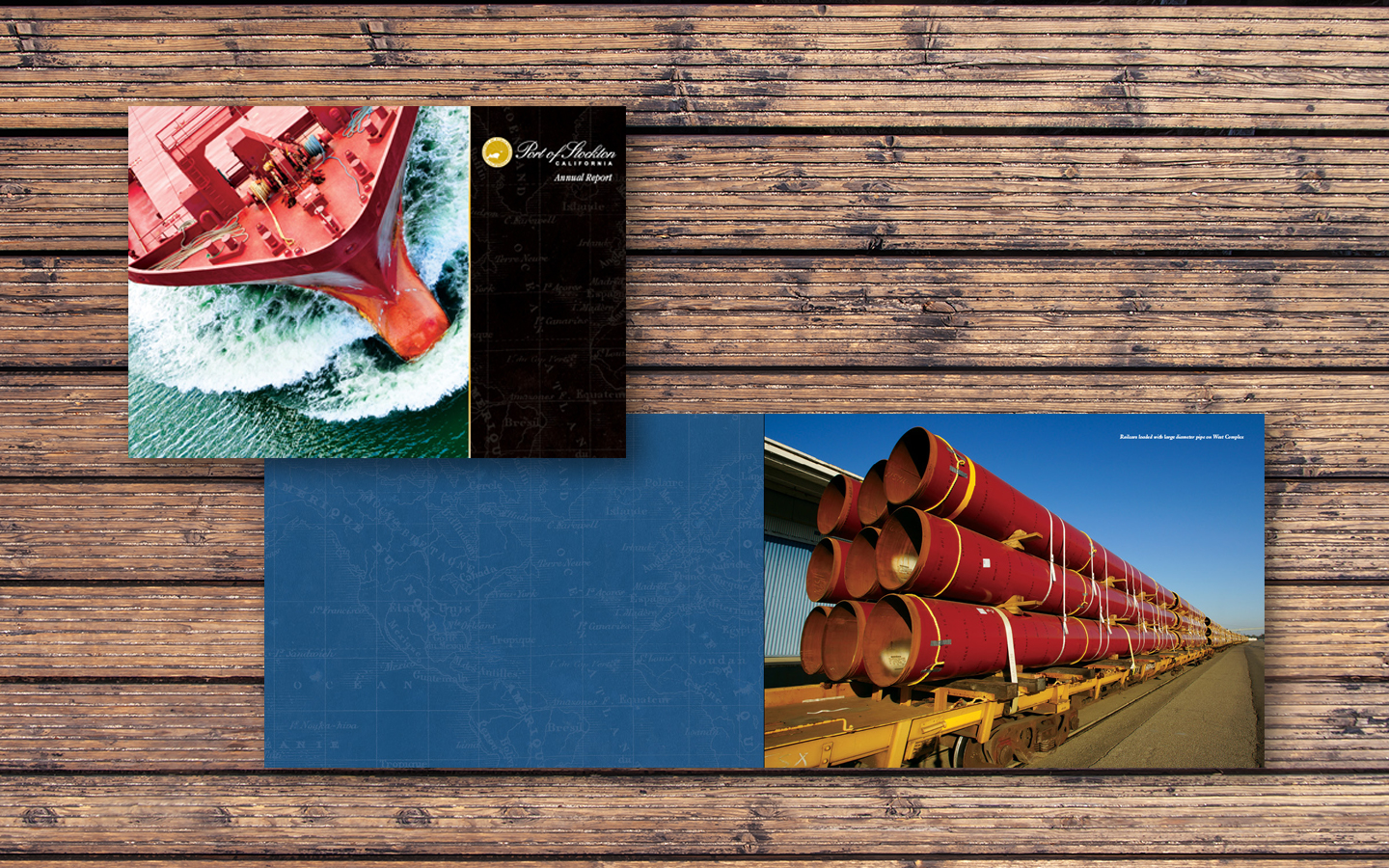
After receiving national awards for designing the Port of Stockton’s annual reports for four of the six previous years, Cummings Design + Advertising created an annual report design that focused on the Port’s primary programs: Exports and Imports, Growth of Port tenants, Environmental programs, and Security programs. Striking, dynamic photography was used to feature the Port’s operations while vintage nautical maps and shipping tags were employed to add visual interest and reinforce its heritage as a successful inland port.
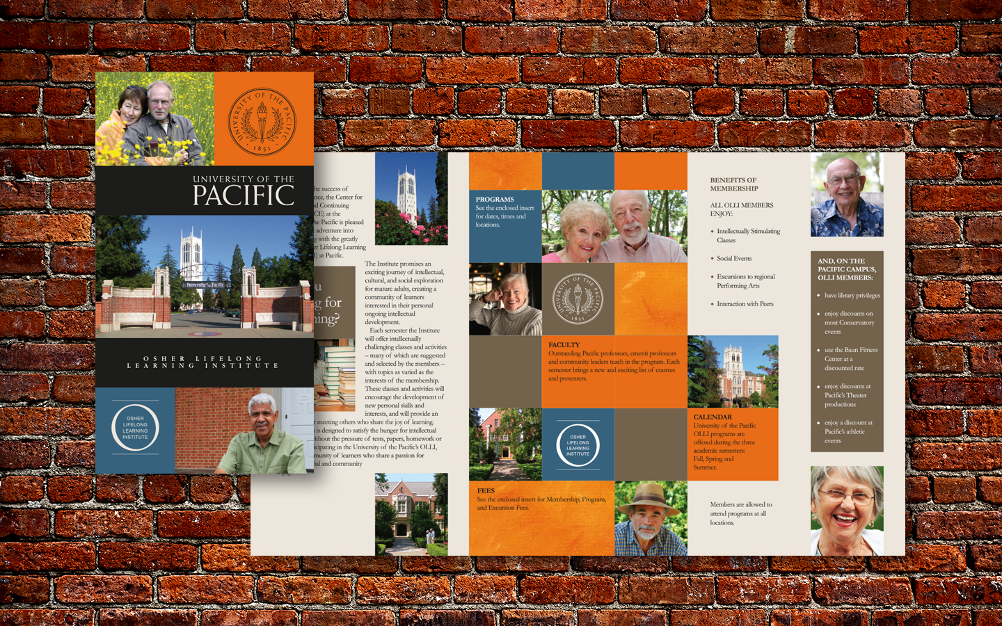
University of the Pacific is known as an institution for higher learning, but in addition they host an on-campus program for senior citizens that provides a combination of learning and social interaction. A brochure was needed to introduce the educational programs to interested parties while delivering a peek into the activities that accompany them. Cummings Design + Advertising created and launched a bold, new brochure designed to reach UOP’s senior audience and reinforce their perceptions of the University’s programs. The brochure captures the optimistic mindset of the passionate seniors UOP seeks to attract. We got there by helping the University move beyond demographics to identify the shared mindset of the audience they sought to reach.
CONTACT INFO
2166 Gerber Drive
Stockton, CA | 95209
Phone: 209-518-1881
Email: cummingsdesign@sbcglobal.net
QUICK LINKS
Home
About Us
Capabilities
Our Works
Contact